Anyway, I must admit that the revamp was held back mostly as I was under the influence of my own sense of swoon. After getting a fine compliment from the great Bernie Wrightston at CCI/SDCC (in July 2008) on my Bats n' Blue card, I held back from the annual update design that should have been due out by last Summer. Change is good. Time to get over it now.

First, I made a photographic transfer via a light box sketch and transferred it on to ribbed Canson pastel paper in graphite. Then washed it out with titanium white acrylic paint. Second shot shows where later I used India ink and a new sumie-e brush I got in San Francisco over it all. There's a handful of mixed media goodies that went over the wash. (Sakura ink pen. Sharpie, coloured pencils, graphite, and aqua-monolith colour pigment sticks.)
For this time around I'm considering neutral shades with some spots of colour, over the former bold blue of the old card but nothings finalized yet. Still playing around with colour choices. (there's a sepia toned one on pastel paper floating around here somplace as well.) The urge to use color is always open to debate with me. Often it's mood. I'd say it's mostly a yippie-skippie one due to the new toys I bought last week. These are the CRETACOLOR Aqua MONOLITH pigment color and sticks and I like them quite a bit. They are the ones shown in the black pouch in the picture, and 2 white ones can be seen on the table.

Text from the set:Derived from the Greek “monos” (sole) and “chroma” (color). Meaning painting and drawing with just one color in different shades. The best known artworks of the modern monochrome trend are the ones of Yves Klein (1928 – 1962). That artist called himself “Yves le Monochrome”.
I would say check them out, the price is about $2.50-3.00 per or you can buy sets for a better deal under $20.00
Pros- excellent pigment concentration and smooth flow for shading. Nice range of colour choices. Opaque coverage is possible if needed.
Cons- Round shape means they 'roll-away' and these break like fragile chalk. The dust/residue created shading large areas builds up quick. Thus, it needs to be blown off the page quite frequently.Shapening is needed frequently. (mildly irritating- but plausible.)
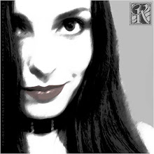
I have a few of these self-portraits that I did for my cards, but this one seems best suited so far.Go figure, it was the first out of the gate. Funny how that happens, like instinct sometimes. Also, I was admittedly distracted most of this past weekend. No A/C and the 3 day heat wave in San Diego killed my energy level a bit. Today the temperature let-up a bit, and I made good progress with a few studies.
K~
No comments:
Post a Comment